Personal Website Examples: A Build Checklist
By the end of this guide you will have a working checklist for building a personal website that actually represents you online, plus a clear sense of what the best personal website examples do differently from the rest. Before you touch a single template, three things need to be ready: a short list of goals for the site, access to your own content such as photos, bio text and portfolio files, and a rough idea of your budget and timeline.
Decide what the site needs to do before you look at templates
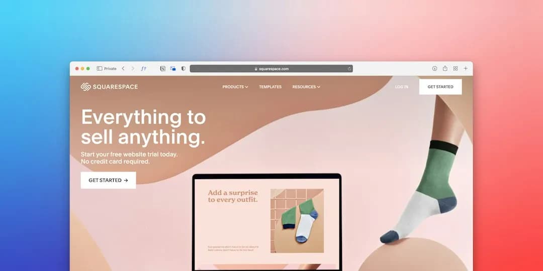
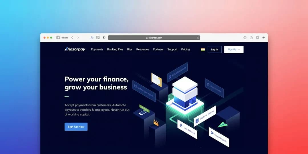
Most people start by browsing personal website examples for visual inspiration, which is understandable but backwards. A personal site can serve very different purposes: a freelance portfolio that needs to convert visitors into clients, a personal blog that just needs to be readable, or a professional landing page that recruiters check before an interview. Each of these needs a different structure, even if the visual style looks similar from the outside.
Write down the one action you want a visitor to take. If you are a freelancer who wants inquiries, the goal is a visible contact form or button. If it is a personal brand page, the goal might simply be building trust through clear writing and real work samples. Read your goal list out loud as a check: if you cannot describe the one action in a single sentence, the goal is still too vague to design around.
Collect and organize your content before any design work starts
This is the step most people skip, and it is the main reason personal website projects drag on for weeks longer than planned. Gather your bio text, project photos, testimonials if you have them, and any documents like a CV or press mentions into a single folder before you open a design tool or hire anyone.
Write a short caption or description for every image and project you plan to include. Check that every page you intend to build, meaning home, about, work and contact, already has at least a paragraph of real text sitting in a document somewhere. If a page only exists as an idea in your head, it is not ready, and starting design on it will just mean redoing the layout later when the real content does not fit.

Pick a structure that matches how people actually browse
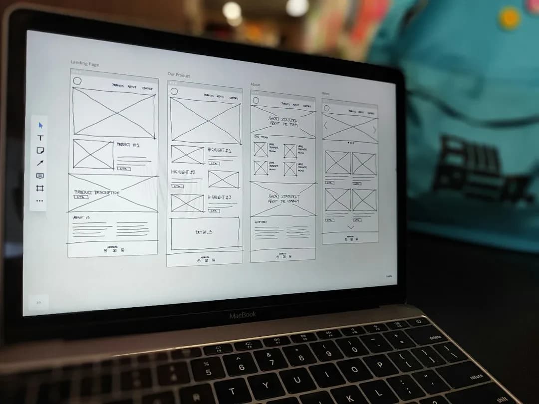
Personal sites rarely need more than four or five pages: a home page, an about section, a work or portfolio section, and a contact page. Adding more sections than you have real content for is one of the most common mistakes in website design, since empty or thin pages make the whole site look unfinished even if the rest is polished.
Study a handful of personal website examples with a specific lens
Instead of scrolling through dozens of inspiration galleries, pick three or four sites in your own field and look at each with one question in mind: how fast does this page tell me who the owner is and what they do? The best personal website examples answer that question within the first screen a visitor sees, without any scrolling or clicking required.
Note what you like about layout, color and navigation separately from what you like about the actual content or copywriting. These are two different skills, and mixing them up leads to copying a layout that does not fit your content at all. Write one sentence per site explaining exactly what you would borrow and why, rather than just noting that you like it.
How do you choose between a page builder and custom development?
Choose a page builder or ready template if your site has five or fewer pages, your content is mostly text and images, and you are comfortable maintaining it yourself. Choose custom development if you need specific functionality such as a booking system, multilingual content, or a design that cannot be achieved with existing templates.
A page builder gets you online in days and costs less upfront, but it trades away flexibility: unusual layouts, custom animations and deeper integrations with other tools become harder or sometimes impossible. Custom website design and development takes longer and costs more, but the site can grow with you instead of hitting a ceiling the moment your needs change. If your plans include a future online store, a booking calendar or a multi-language setup, it is usually worth starting with a properly built foundation rather than migrating everything later. We handle this kind of project through our web design and development work, where the technical foundation is built to support growth rather than just to launch quickly.
Build the first working draft and test it on a real visitor
Put together a rough version of the home page and one secondary page, even if the design is not final, and send the link to someone who does not know your project well. Ask them to find your contact information or your main work sample without any hints from you.
Watch where they click first and where they hesitate. Time how long it takes them to reach the action you defined earlier. If it takes more than a few seconds of visible confusion, the navigation or the home page copy needs rework before you move further into design. This single test catches more real problems than any amount of staring at the draft yourself.
Apply the same logic to a corporate website
The same testing habit applies if you are responsible for a corporate website rather than a personal one. Corporate website design usually serves more stakeholders and has to balance brand guidelines with usability, but the verification method stays the same: watch a real person try to complete the main task and see exactly where they get stuck.
Finalize design details without losing sight of load speed
Once the structure is confirmed, move into visual polish: typography, color, spacing and image quality. A common mistake here is adding large, uncompressed images because they look sharp on your own screen, which then makes the site slow for visitors on mobile connections.
Compress every image before upload and check the page on a phone with the screen brightness turned up, since that is closer to how most visitors will actually see it. Load the home page on a mobile device over a regular connection and time how long it takes before the main content becomes visible. If the wait feels noticeable to you, it will feel longer to a visitor who had no idea what to expect.

Publish, then set a short follow-up review
Launching is not the finish line, even for a personal site. Set a reminder for two to four weeks after launch to check whether contact form submissions are arriving in your inbox, whether links still work, and whether the content still reflects your current work.
Submit a test message through your own contact form and confirm that you receive it. A silently broken form is one of the most common and most invisible failures on personal sites. If you are running a small business page or a freelance portfolio with paying clients depending on it, this review habit matters just as much as the initial build.
Recover from the most common mistake: starting with design instead of content
The typical failure pattern looks like this: someone picks a beautiful template first, then tries to force their actual bio, photos and project descriptions into boxes that were never sized for them. The result is awkward cropping, cut-off text, and a site that looks like a template wearing someone's name rather than a person.
If you recognize this happening, stop and go back to the content step. Rewrite your text to match the space you actually have, or pick a different section layout that fits the content you already wrote, rather than endlessly shortening real information just to fit a box. This single reversal fixes more half-finished personal sites than any amount of extra design tweaking ever will.
Before calling the project done, run through this: goals written in one sentence, content collected in a single folder, structure limited to pages you actually have material for, one outside person has tested navigation, images compressed and checked on mobile, contact form tested with a real submission, and a follow-up review scheduled for a few weeks out. If any one of these is missing, the site is not finished yet, even if it looks finished on your own screen.
If your project has grown past a simple personal page and now needs features like online booking, a store, or multilingual support, it may be worth treating it as a custom build rather than a template patch job. You can browse examples of this kind of work in our portfolio before deciding which direction fits your needs.
If you already have a clear idea of what you want built and are ready to talk through scope and budget, you can get in touch through our get a quote page and we will help you figure out the right approach for your situation.